CSS, or Cascading Style Sheets, is the backbone of web design. It allows us to style HTML elements and give life to our webpages. In this post, we’ll walk through a project where we replicate stylish buttons inspired by YouTube and Twitter, diving into fundamental CSS concepts along the way.
Setting Up the Project
To get started:
- Create a new file called
buttons.html. - Open it in your browser to preview changes as we go.
Below is our initial setup:
<!DOCTYPE html>
<html>
<head>
    <title>CSS Buttons</title>
</head>
<body>
    <button>Subscribe</button>
</body>
</html>
Here’s what the initial button looks like in the browser:

Adding Style with CSS
To style the button, we’ll add a <style> element inside the <head> section of our HTML:
<style>
    button {
        background-color: red;
        color: white;
        border: none;
        height: 36px;
        width: 105px;
        border-radius: 4px;
        cursor: pointer;
    }
</style>
After saving and refreshing, our button transforms:

Understanding the CSS Code
Here’s a breakdown of the CSS properties we used:
background-color: Sets the button’s background color.color: Changes the text color.border: Removes the border.heightandwidth: Define the button’s size.border-radius: Rounds the corners for a sleek look.cursor: Changes the mouse pointer to a hand when hovering over the button.
Adding a Second Button
Now, let’s add another button labeled “Join”:
<button class="subscribe-button">Subscribe</button>
<button class="join-button">Join</button>
We use the class attribute to apply specific styles to each button. Here’s the updated CSS:
<style>
    .subscribe-button {
        background-color: red;
        color: white;
        border: none;
        height: 36px;
        width: 105px;
        border-radius: 4px;
        cursor: pointer;
    }

    .join-button {
        background-color: white;
        color: blue;
        border: 2px solid blue;
        height: 36px;
        width: 105px;
        border-radius: 4px;
        cursor: pointer;
    }
</style>
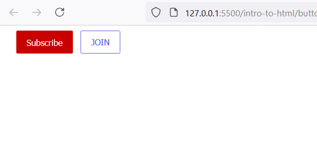
This results in two buttons styled differently:

Using a Color Picker
To fine-tune colors, many code editors (like VS Code) offer built-in color pickers. Hover over a color value to adjust it precisely. For example, switching from red to an RGB value like rgb(200, 0, 0) helps us match the exact YouTube red.
Hover Effects
Let’s add some interactivity. Update the CSS to include hover states:
.subscribe-button:hover {
    background-color: darkred;
}

.join-button:hover {
    background-color: lightblue;
    color: white;
}
Now, hovering over each button gives instant feedback, making the design more engaging:
Conclusion
CSS is all about experimenting and learning through practice. By replicating real-world designs like YouTube and Twitter buttons, you not only understand CSS syntax but also gain the skills to tackle more complex projects. Don’t forget, when you’re stuck, Google is your best friend! Search for properties like “CSS rounded corners” or “CSS button hover” to find solutions quickly.
Let us know in the comments if you enjoyed this lesson and share your styled buttons with us!
watch this tutorial video for better understanding.

